On this page
Introduction
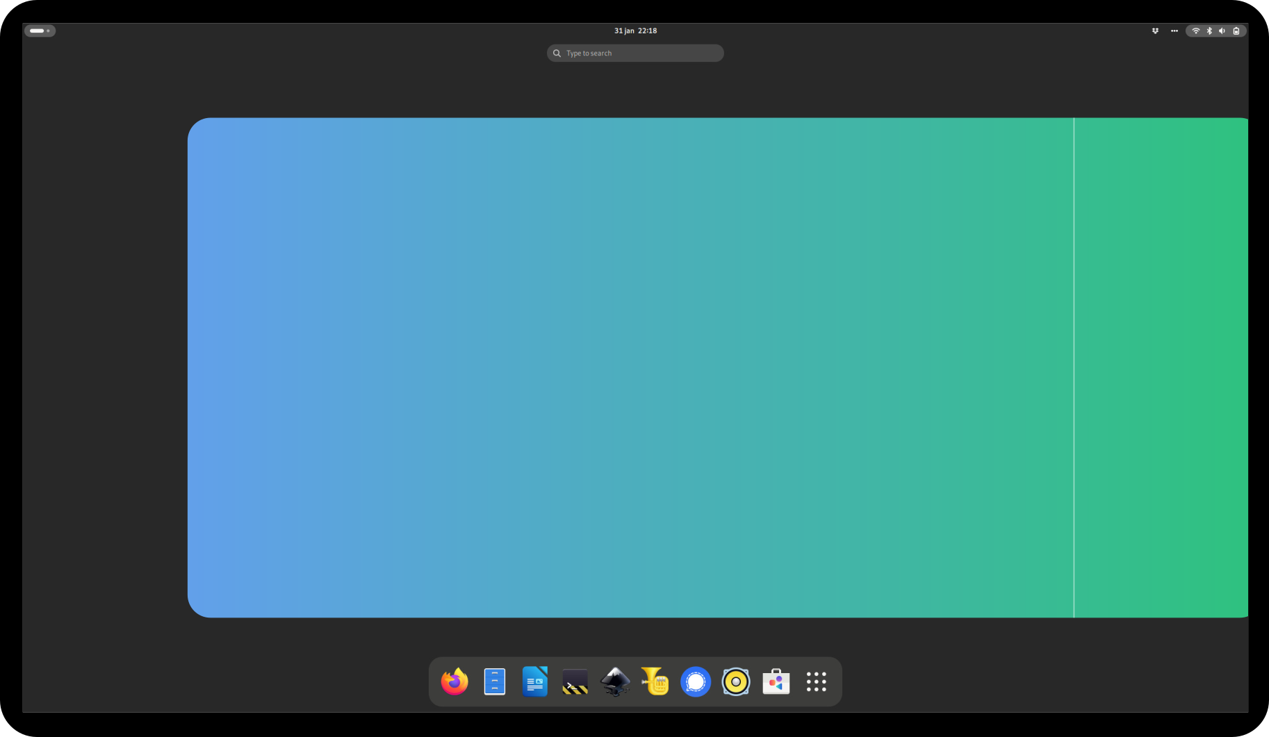
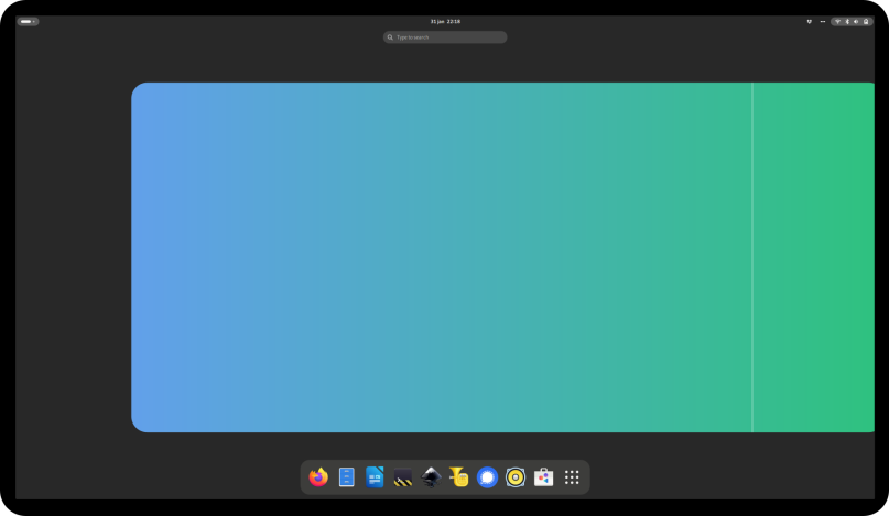
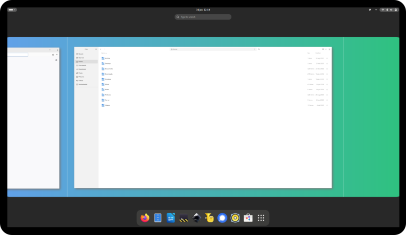
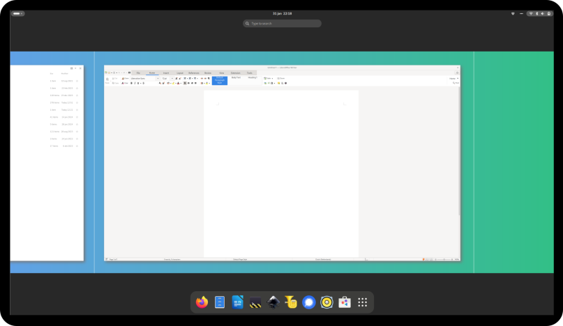
Inspired by the current design of the GNOME-desktop, my earlier experimentation with window and workspace management, PaperWM and the release of the Niri compositor, I wondered how GNOME would look like if it consisted of one big horizontal workspace with all windows placed next to each other.
It would work in the following way:
- You only have one big horizontal workspace.
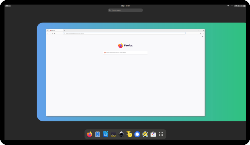
When a new window is opened, the workspace grows to the right - All windows are placed next to each other.
* Windows are opened at the right side of the previous one.
* Windows are opened full-screen if applicable.
* On a regular monitor, a new window is opened on a new 'sub-workspace'.
* On ultra-wide monitors, a new window is open on the next half of the 'sub-workspace'.
A 'sub-workspace' corresponds with a normal workspace in the current GNOME-design, but is visually part of the one big horizontal workspace.
Gallery
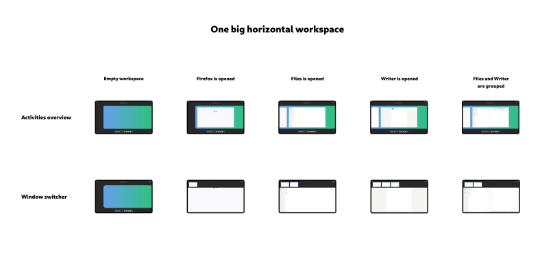
One big horizontal workspace
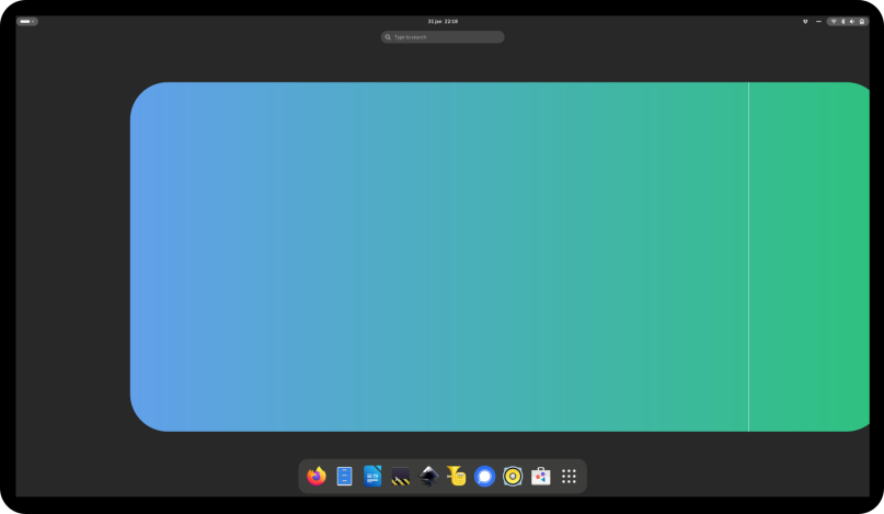
Activities overview
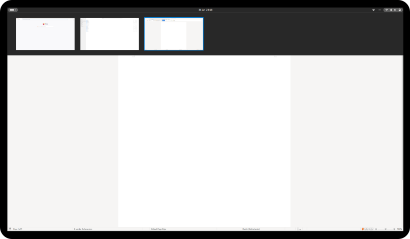
Window switcher
Advantages
- The placement of windows is more predictable and windows are easier to find.
- It's easier for users to visualise the placement of the windows.
- It aligns with the horizontal design of the top bar and the activities button.
Disadvantages
- The workspace can become very long.
- Most of the time a user wants to have an application (like e.g. GNOME Files) near the application he/she is working with, while in this design it would be placed at the end of the list. After placement, the user has to manually rearrange the windows.
- For small applications (like e.g. the Calculator app) it doesn't make sense to place them on a new sub-workspace.
Notes
- The windows switcher is not part of the current GNOME-desktop, but it would make switching between windows easier and more efficient.
- Not show in the above design, but the user should be able to switch between sub-workspaces by scrolling over the top bar (like the extension Panel scroll does).
What is not shown
- Animations
To make it look and behave really good, short animations should be added (like the current GNOME-desktop has). - Multi-monitor setups
Different mock-ups should be made. - Mobile view
Good news is that on GNOME mobile shell the applications are also shown horizontally.
